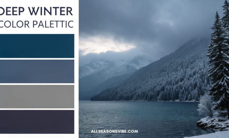
21+ Deep Winter Color Palette Ideas to Create a Cozy & Elegant Look in 2026
Picture a room wrapped in the rich tones of a deep Winter color palette—think smoky charcoal, midnight blue, and velvety burgundy—while a soft metallic shimmer catches the candlelight. Winter design doesn’t have to feel cold.
By layering shades from a cool Winter color palette with touches of dark, cozy neutrals, you can create spaces that feel both dramatic and welcoming.
In this guide, you’ll find inspiration for every style: a dark Winter color palette for moody sophistication, a metallic Winter color palette that sparkles for the holidays, even a gentle pastel Winter color palette for those who crave softness.
Whether you love the crisp elegance of monochromatic décor or the warmth of a cozy Winter retreat, these ideas will help you mix and match hues with confidence.
From paint choices to accent textiles, we’ll explore how these palettes work together so you can refresh any room—large or small—with timeless, elegant Winter vibes.
Understanding the Deep Winter Color Palette
Before diving into specific combinations, it helps to know what defines a deep Winter color palette. Deep Winter shades are rich, cool, and highly saturated—think the darkest berries, inky blues, and luxurious charcoals. Unlike lighter seasonal palettes, these colors have a strong presence and naturally evoke warmth and elegance.
Key traits include:
- Cool Undertones: Blue- or violet-based pigments keep the look crisp and sophisticated.
- High Contrast: Pairing dark bases with brighter highlights creates striking depth.
- Year-Round Appeal: Though seasonal in inspiration, these colors transition effortlessly beyond the holidays.
This foundation makes it easy to branch into variations such as a cool Winter color palette, a metallic Winter color palette, or a soft pastel Winter color palette while maintaining that quintessential deep Winter vibe.
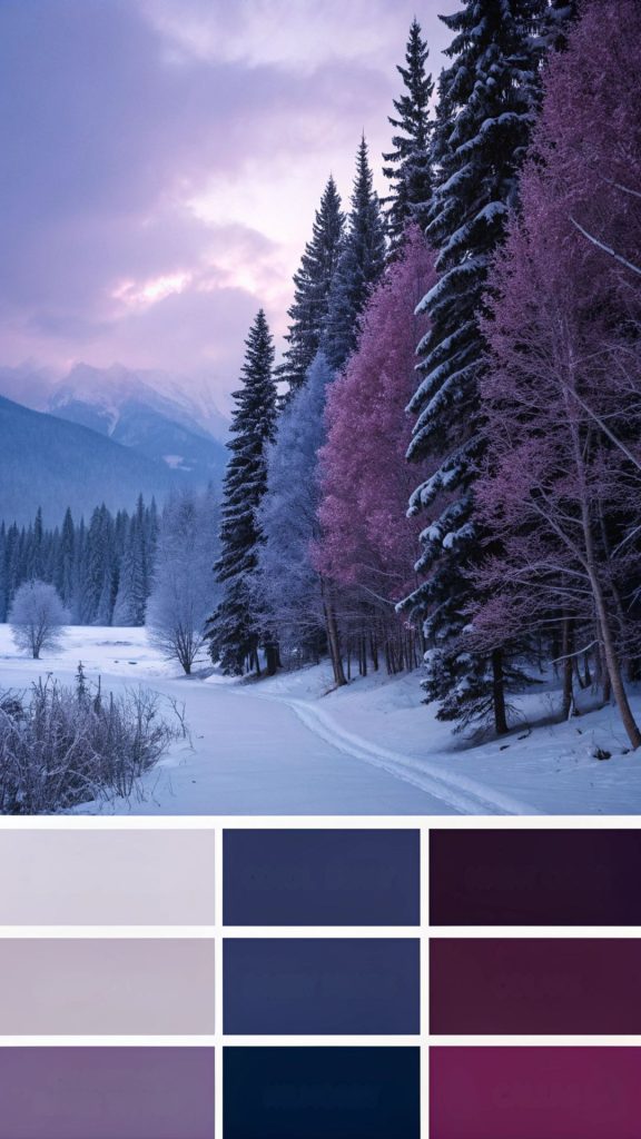
Classic Deep & Dark Winter Color Palettes
When most people imagine Winter interiors, deep jewel tones and shadowy neutrals immediately come to mind. These dark Winter color palettes remain timeless because they bring a sophisticated coziness that feels appropriate for long nights and candlelit gatherings. Below are three striking combinations that embody this enduring style.
1. Midnight Navy & Pewter Gray
Why It Works: Midnight navy is the ultimate deep Winter neutral—rich, calming, and versatile—while pewter gray adds a sleek, contemporary edge. Together, they echo a clear night sky dusted with Winter stars.
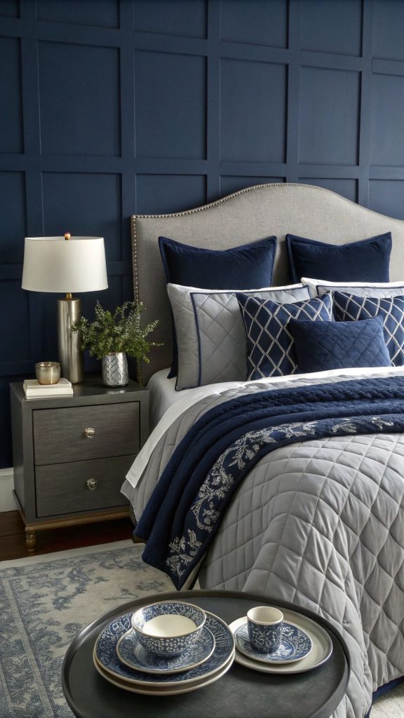
Where to Use:
- Accent walls: A navy wall behind a bed or sofa creates a cocoon-like effect.
- Bedding & linens: Layer navy duvet covers with pewter-gray sheets for instant hotel-chic vibes.
- Matte dinnerware: Navy ceramic plates paired with pewter chargers make an elegant holiday table.
Style Tip: Break up the depth with crisp white trim or molding. This small contrast keeps the cool Winter color palette feeling fresh instead of heavy, perfect for modern or transitional homes.
2. Black Forest Green & Charcoal
Why It Works: Forest green carries natural elegance, reminiscent of evergreen trees in fresh snow. Charcoal underscores that drama, resulting in a look that’s moody yet grounding.
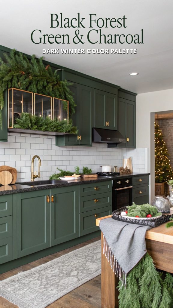
Where to Use:
- Kitchen cabinetry: Matte forest green cabinets with charcoal countertops feel upscale and inviting.
- Velvet sofas: A plush sofa in forest green instantly becomes the room’s centerpiece.
- Winter tablescapes: Layer charcoal linens with green foliage for a festive, organic feel.
Style Tip: Brushed brass hardware or lighting warms the contrast and adds a soft glow—perfect for balancing a dark Winter color palette without losing sophistication.
3. Deep Burgundy & Aubergine
Why It Works: These wine-inspired hues are bold and romantic, bringing a touch of old-world glamour to Winter décor. Burgundy adds richness while aubergine (a deep eggplant) provides a mysterious counterpoint.
Where to Use:
- Statement curtains: Heavy burgundy drapes look luxurious and help insulate against Winter drafts.
- Upholstered chairs: Accent chairs in aubergine velvet create a regal focal point.
- Area rugs: A patterned rug mixing both hues instantly warms up hardwood floors.
Style Tip: Balance the intensity with creamy neutrals—think ivory throw blankets or pale carpeting—for a cozy Winter color palette that feels lush but never overwhelming.
Cool Winter Color Palette Ideas
Cool undertones are the hallmark of an elegant Winter color palette, giving interiors that crisp, icy vibe without feeling clinical. These combinations work beautifully in modern spaces, especially when layered with soft textures.
4. Glacier Blue & Crisp White
Imagine the reflective surface of a frozen lake. Glacier blue paired with pure white captures that serene, frosted look.
Where to Use: Bathrooms benefit from these hues for a spa-like retreat. Bedrooms feel airy and tranquil when bedding and walls share these tones. Even minimalist holiday décor—white lights on a frosty-blue tree skirt—shines in this cool Winter color palette.
5. Steel Gray & Silver
Industrial chic meets Winter elegance. Steel-gray walls create depth, while silver accents—candleholders, picture frames, or a metallic backsplash—bounce light around the room.
Where to Use: Loft apartments, dining rooms, or home offices where you want a cool Winter color palette with a modern edge.
6. Arctic Teal & Frosted Lilac
This unexpected duo balances the jewel-tone depth of teal with delicate lavender highlights.
Where to Use: Accent pillows on a gray sofa, abstract artwork in a neutral hallway, or a statement wall in a creative workspace. The mix feels both fresh and sophisticated.
Metallic Winter Color Palette for Sparkle and Drama
For those who crave a little glam, a metallic Winter color palette adds shimmer and sophistication—perfect for festive occasions or year-round elegance.
7. Platinum & Ice Gold
Soft metallics that feel airy and upscale.
Where to Use:
- Festive dinner settings: Platinum chargers and ice-gold cutlery create a dazzling table.
- Statement lighting fixtures: Think pendant lights with frosted-gold interiors.
8. Gunmetal & Bronze
Combining cool and warm metallics creates an unexpected, high-end look.
Where to Use: Bronze hardware against gunmetal cabinets in a kitchen or bath offers striking contrast and instant drama.
9. Silver, Pewter & Deep Sapphire
Silver reflects light beautifully while deep sapphire grounds the palette.
Where to Use: Ideal for New Year’s Eve tablescapes, glamorous living rooms, or a jewel-toned bedroom. Layer plush sapphire pillows with pewter throws and silver trays for effortless luxury.
Related Article: 35+ Christmas Color Palette Ideas for 2025: Modern & Timeless Scheme
Cozy Winter Color Palette for Warmth
Even within deep Winter hues, you can create a sense of comfort and welcome. These palettes focus on earthy tones and soft neutrals to balance Winter’s chill.
10. Cocoa Brown & Cream
This combination evokes the comfort of hot chocolate by the fire.
Where to Use:
- Living rooms: Pair cocoa-brown leather sofas with cream wool throws.
- Bedrooms: Chocolate-hued quilts against cream walls feel restful and grounded.
11. Mulled Wine & Warm Taupe
A romantic pairing that instantly feels intimate and inviting.
Where to Use: Bedrooms, reading nooks, or small dining spaces where you want to encourage lingering conversations.
12. Smoky Plum & Soft Beige
Adds subtle color while keeping the overall aesthetic serene.
Where to Use: Drapery, throw blankets, or area rugs in a neutral living room. Smoky plum provides a hint of drama without overpowering, making it a versatile choice for those exploring a cozy Winter color palette with depth.
Cozy Winter Color Palette for Warmth
Even when working with deep Winter hues, you can craft interiors that feel snug and welcoming. The key is balancing rich, saturated colors with creamy neutrals, tactile fabrics, and layered lighting to create a cocoon-like atmosphere. These combinations invite you to curl up with a blanket and a good book while the wind howls outside.
13. Cocoa Brown & Cream
Why It Works: This pairing instantly conjures the image of hot chocolate by the fire. Cocoa brown delivers grounding warmth, while cream keeps the palette light and breathable.
Where to Use:
- Living Rooms: Anchor the space with a cocoa-brown leather sectional or velvet sofa.
- Textiles: Add cream-colored chunky knit pillows, faux-fur throws, and a wool area rug.
- Kitchen or Dining: Cream cabinetry with a cocoa tile backsplash feels timeless yet cozy.
Style Tip: Introduce brass or copper accents—like a gleaming kettle or a metallic picture frame—for a subtle sparkle that enhances the earthy richness.
14. Mulled Wine & Warm Taupe
Why It Works: Inspired by the glow of spiced red wine, this duo exudes quiet romance. The taupe softens the intensity of the deep red, creating a balanced and approachable scheme.
Where to Use:
- Bedrooms: Layer mulled-wine linens over warm taupe walls for a sophisticated sanctuary.
- Reading Nooks: A plush armchair in wine velvet against a taupe background sets an intimate tone.
- Dining Spaces: Taupe table linens with mulled-wine napkins create an inviting holiday table.
Style Tip: Add candlelight or dimmable sconces to emphasize the warm, moody atmosphere these colors naturally create.
15. Smoky Plum & Soft Beige
Why It Works: Smoky plum introduces a touch of regal elegance without overwhelming a room, while soft beige provides a calm counterpoint.
Where to Use:
- Living Areas: Upholstered armchairs in plum paired with beige curtains strike the perfect balance.
- Bedrooms: Beige bedding with plum accent pillows keeps the look serene yet stylish.
- Art & Accessories: Abstract artwork featuring both hues ties the palette together.
Style Tip: Choose matte finishes and natural textures—linen, raw wood, or rattan—to keep the pairing grounded and restful.
Pastel Winter Color Palette for Soft Sophistication
Pastels aren’t just for spring. A pastel Winter color palette works beautifully when it incorporates cool undertones and crisp neutrals, creating a frosty, soft look that’s seasonally appropriate.
16. Dusty Rose & Mist Gray
Why It Works: Dusty rose brings a gentle warmth, while moody mist gray ensures the look remains elegant rather than girlish.
Where to Use:
- Bedrooms: Dusty rose bedding with mist-gray walls feels chic and restful.
- Living Rooms: A mist-gray sofa with dusty rose throw pillows introduces subtle romance.
- Holiday Décor: Combine these hues in wreaths or garlands for a contemporary twist.
Style Tip: Add brushed nickel hardware or glass accents to enhance the cool, wintry vibe.
17. Powder Blue & Pearl
Why It Works: This pairing offers a frosty, icy effect, reminiscent of a frozen lake under moonlight.
Where to Use:
- Window Treatments: Sheer pearl curtains against powder-blue walls maximize natural light.
- Table Linens: Perfect for a Winter brunch or holiday dinner.
- Bathroom Accents: Towels and bath mats in these hues create a serene spa feel.
Style Tip: Incorporate crystal or mirrored accessories to reflect light and keep the palette sparkling.
18. Lavender Fog & Charcoal
Why It Works: Soft lavender gains sophistication when grounded by deep charcoal, keeping the palette chic rather than sweet.
Where to Use:
- Bedrooms: Charcoal bedding with lavender accent pillows is understated yet stylish.
- Art & Décor: Abstract prints featuring both hues add dimension to neutral spaces.
- Office Spaces: Lavender walls paired with charcoal furniture encourage calm focus.
Style Tip: Use matte black frames or hardware to sharpen the overall aesthetic.
Elegant Winter Color Palette for Timeless Style
If you’re drawn to high-end interiors or fashion, an elegant Winter color palette instantly elevates any space. These combinations are rich, refined, and perfectly suited to both modern and traditional design.
19. Ivory, Jet Black & Gold
Why It Works: This classic trio balances stark contrast with luxurious shine, ensuring visual drama without feeling busy.
Where to Use:
- Kitchens: Black marble countertops, ivory cabinetry, and gold fixtures create an upscale statement.
- Formal Living Rooms: Ivory sofas with black side tables and gold lighting exude sophistication.
- Holiday Parties: Black-and-ivory table settings with gold flatware sparkle beautifully.
Style Tip: Keep patterns minimal—let the bold color contrast and metallic accents speak for themselves.
20. Charcoal, Emerald & Champagne
Why It Works: Deep emerald adds richness, while champagne metallics provide a celebratory touch.
Where to Use:
- Living Rooms: Charcoal walls with emerald velvet curtains feel dramatic and glamorous.
- Dining Areas: Champagne-gold chargers against emerald placemats create a festive table.
- Entryways: A statement emerald rug beneath charcoal-painted walls sets an opulent tone.
Style Tip: Layer in soft lighting—like glass chandeliers or crystal lamps—to highlight the jewel tones.
21. French Blue & Antique Silver
Why It Works: Romantic and slightly vintage, this pairing evokes the elegance of a Parisian apartment.
Where to Use:
- Formal Dining Rooms: Antique silver flatware against French-blue table linens is timeless.
- Bedrooms: French-blue bedding with silver-framed mirrors enhances a serene atmosphere.
- Accent Walls: A single French-blue wall with antique silver picture frames adds refined charm.
Style Tip: Choose patinaed silver rather than high-shine chrome for a softer, heirloom feel.
Monochromatic Winter Color Palette Ideas
A monochromatic Winter color palette relies on layers of a single hue to create depth and sophistication. By varying shades, textures, and finishes, you achieve richness without needing multiple colors.
22. Shades of Charcoal
Why It Works: From pale dove gray to deep graphite, these layers create architectural drama and a sleek, modern vibe.
Where to Use:
- Open-Concept Spaces: Different charcoal tones on walls, rugs, and furniture define zones without harsh breaks.
- Bedrooms: Combine light-gray bedding with deep-charcoal accent pillows for subtle contrast.
- Bathrooms: Charcoal tile in mixed finishes—matte and glossy—adds texture and interest.
Style Tip: Add warm wood accents or soft lighting to keep the look inviting rather than stark.
23. Blue on Blue
Why It Works: Mixing indigo, denim, and sky blue yields a tranquil retreat reminiscent of crisp Winter skies.
Where to Use:
- Living Rooms: Layer blue-toned rugs, throw pillows, and artwork to create cozy cohesion.
- Bedrooms: Indigo headboards with pale-blue walls feel both calming and luxurious.
- Art Studios or Offices: The varying blues can boost creativity and focus.
Style Tip: Introduce white trim or natural wood furniture to break up the saturation.
24. Wine Gradient
Why It Works: Burgundy, merlot, and soft rose add dimension while staying within a single color family, creating warmth with elegance.
Where to Use:
- Dining Rooms: Gradient table settings, from pale rose napkins to deep burgundy chargers, impress guests.
- Living Spaces: Ombre curtains or layered rugs in these tones feel rich and inviting.
- Bedrooms: Merlot bedding with pale-rose throw pillows is luxurious without being overpowering.
Style Tip: Accent with metallic gold or brass for an extra festive touch that enhances the richness of the wine tones.
Mixing & Matching for Personal Style
The beauty of these 21 deep Winter color palette ideas is that they’re flexible building blocks, not rigid rules. You can customize them to suit your taste, your home, and even the changing seasons.
Start with a dark Winter color palette base—think navy, charcoal, or forest green—for structure and depth. Then sprinkle in a metallic Winter color palette accent like brushed gold or shimmering pewter to give your space holiday sparkle and year-round elegance. Prefer something lighter? Layer a cozy Winter color palette (mulled wine, cocoa brown) with a pastel Winter color palette (powder blue, dusty rose) for a sophisticated contrast that feels warm yet airy.
Tips for Successful Mixing:
- Balance Temperature: Keep undertones consistent—cool with cool, warm with warm—to avoid a jarring clash.
- Play with Texture: Velvet, faux fur, linen, and matte metals create tactile variety and visual interest.
- Use the 60-30-10 Rule: Distribute colors strategically: 60% main color, 30% secondary color, 10% accent for an effortlessly harmonious look.
Practical Applications Across Your Home
Color palettes are most powerful when they connect room to room. Here’s how to apply these ideas throughout your living space:
Living Room
- Anchor the space with a deep Winter color palette such as navy and pewter on the walls.
- Add metallic Winter color palette accents—mirrors, lamps, or metallic-thread pillows—for instant dimension.
- Mix in cozy textures like chunky knit throws to keep it welcoming.
Kitchen
- Choose emerald cabinetry with brushed bronze handles for a luxurious dark Winter color palette statement.
- Balance with marble or quartz countertops to keep the space bright and airy.
- Introduce small metallic accessories—like silver canisters—for subtle sparkle.
Bedroom
- Go for a cozy Winter color palette—mulled wine paired with warm taupe—for a restful retreat.
- Layer soft beige bedding with accent pillows in deep plum or cocoa to create visual warmth without heaviness.
Holiday Décor
- Combine a cool Winter color palette (glacier blue, crisp white) with a metallic Winter color palette (platinum, silver) for chic seasonal decorations that feel sophisticated, not kitschy.
- Add frosted greenery or glass ornaments to echo icy undertones.
Fashion & Personal Style
These palettes extend far beyond home décor; they can guide your wardrobe and accessories all Winter long.
Outerwear
- A deep Winter color palette coat—think deep burgundy wool or a tailored navy pea coat—offers timeless elegance and easy layering.
Accessories
- Add pops of shine with metallic Winter color palette touches such as silver boots, bronze handbags, or an emerald scarf that doubles as a jewel-tone accent.
Occasion Wear
- Embrace luxury with velvet dresses in moody blues or shimmering gunmetal for evening events.
- Pair pastel accessories like dusty rose gloves with a charcoal coat for subtle contrast.
By using these palettes as a guide, you can create a cohesive seasonal wardrobe that looks curated and stylish.
Lighting & Seasonal Accents
Lighting is the secret ingredient that determines how every Winter color palette reads in real life.
- Warm White Bulbs: Perfect for softening a cool Winter color palette, giving icy blues or grays a cozier glow.
- Natural Light: Daylight enhances the richness of a dark Winter color palette, especially emerald greens and deep navies.
- Candlelight: Adds a romantic shimmer to metallic Winter color palettes, making silver or bronze accents truly sparkle.
Consider dimmable fixtures or layered lamps to adapt the mood from morning brightness to evening intimacy.
Budget-Friendly Tips
You don’t need a full remodel to bring these color schemes to life. Small, thoughtful updates can make a dramatic impact.
- Textiles: Swap out pillows, throws, curtains, and even lampshades in seasonal hues. This is the quickest way to refresh a space without major expense.
- Paint an Accent Wall: A single wall in deep emerald, charcoal, or navy provides instant architectural depth.
- DIY Metallic Accents: Spray-paint picture frames, vases, or decorative trays in silver or bronze to introduce a metallic Winter color palette for just a few dollars.
- Seasonal Greenery: Add eucalyptus or pine boughs to vases for natural texture that complements both dark and pastel Winter tones.
Seasonal Transitions
The advantage of a deep Winter color palette is its adaptability. As spring approaches, lighten accessories (add white or pastel accents) while keeping your rich base intact, ensuring your home flows naturally through the seasons.
Final Thoughts,
A thoughtfully chosen deep Winter color palette can transform your home into a seasonally stylish haven. Whether you’re drawn to a moody dark Winter color palette, shimmering metallic Winter color palette, or the understated grace of an elegant Winter color palette, these ideas prove you don’t need a huge budget or a complete remodel to create impact.
Start with one or two hues you love, layer textures, and play with light to bring out the season’s natural drama. From cozy reading corners to festive dining rooms, Winter design is all about embracing depth and comfort.
Ready to refresh your space? Pick a palette that speaks to you and let your creativity guide the way—because every home deserves a touch of cool, sophisticated Winter magic.