10 Summer Color Palette Ideas for Home Decor (Cool + Light Aesthetic Trends 2026)

Choosing the right Summer color palette can completely change how your home feels. I’ve seen even the simplest rooms look brighter, bigger, and more relaxing just by switching colors. Summer is all about light, softness, and fresh energy.
You don’t need a full makeover. Just the right colors. The right combinations. That’s what makes the difference.
In this post, I’ll share the best cool and light Summer color palettes you can actually use. Simple ideas. Easy to follow. Perfect for any space.
🎨 1. Light Neutral Palette
A light neutral palette is the easiest place to start. It feels clean, simple, and timeless. I always recommend this for small spaces because it instantly makes a room look bigger and calmer. It’s also very easy to style with other colors.
To create this look:
- Use white, beige, and soft cream as your base
- Add light wood tones for warmth
- Keep furniture minimal and clean-lined
- Use soft textures like linen or cotton
- Avoid dark or heavy contrasts
This palette works in any room. It’s safe. It’s stylish. And it always feels like Summer.
Related: 12 Cheap Summer Decor Ideas That Look Expensive
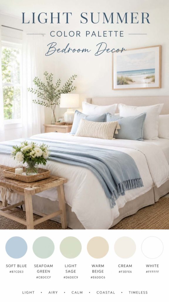
🌊 2. Soft Blue & White Combo
Blue and white is a classic Summer color palette. It feels fresh, airy, and peaceful. I’ve seen this combination instantly bring a calm, coastal vibe to any room. It’s perfect if you want something simple but still noticeable.
To use this palette:
- Pair soft blue walls or decor with white furniture
- Use striped or patterned blue cushions
- Add white curtains for brightness
- Include light wood or woven textures
- Keep everything balanced and not too bold
This combo works especially well in bedrooms and living rooms. It’s clean, relaxing, and very easy to style.
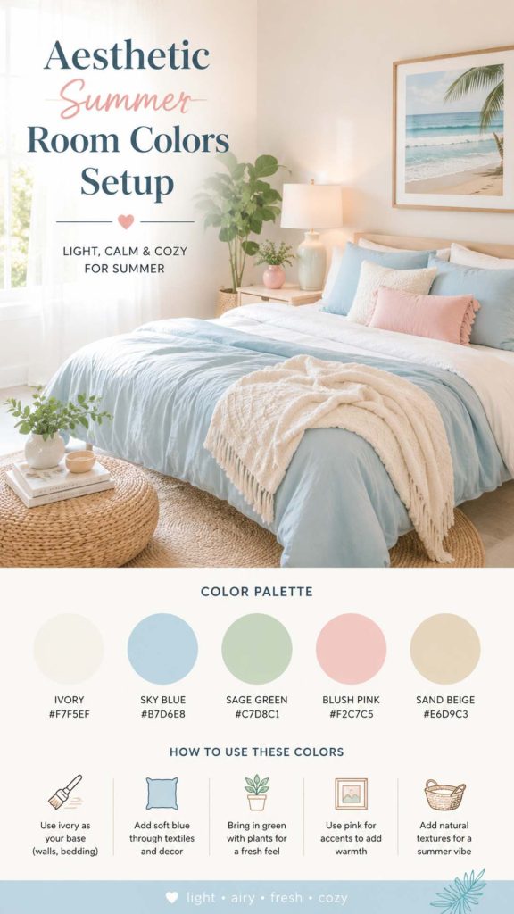
🌸 3. Pastel Summer Colors
Pastels are perfect for Summer. They feel soft, light, and aesthetic. I love using pastel tones when I want a space to feel calm but still playful. They work especially well for aesthetic room ideas.
Try these pastel combinations:
- Soft pink + white
- Light lavender + beige
- Baby blue + cream
- Mint green + light wood
- Mix 2–3 colors, not too many
Pastels are great for small accents too. You don’t need to change everything. Just a few pieces can transform your space.
Related: 12 Summer Front Porch Decor Ideas (Cozy + Budget-Friendly)
🌿 4. Earthy Summer Tones
Earthy tones bring warmth without feeling heavy. They connect your space with nature. I’ve seen this palette work really well for people who want a natural and grounded look.
To create earthy Summer tones:
- Use warm beige, tan, and soft brown
- Add clay or terracotta accents
- Mix with soft greens for balance
- Use natural materials like wood and rattan
- Keep textures soft and organic
This palette feels calm and natural. It’s perfect if you want something different from typical bright Summer colors.
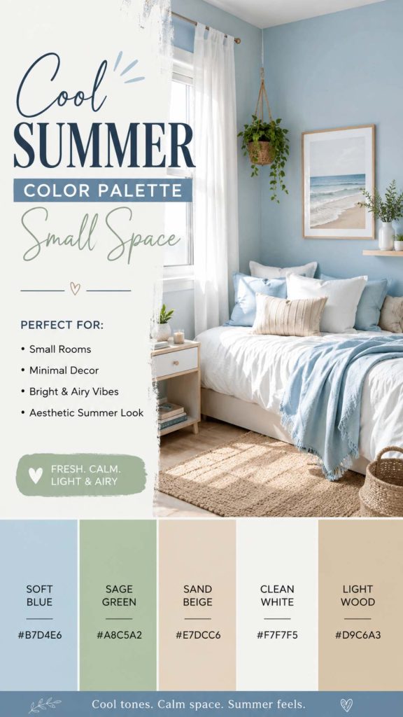
🏝️ 5. Coastal Color Palette
A coastal palette is one of the most popular cool Summer color palette choices. It feels like the beach—light, open, and relaxing. I’ve seen this style work in almost any home.
To achieve this look:
- Use white as your base color
- Add shades of blue (light to medium)
- Include sandy beige tones
- Use woven or rope textures
- Keep decor simple and airy
This palette creates a vacation-like feel at home. It’s perfect for Summer.
🤍 6. Minimal White + Beige
This is for those who love simplicity. White and beige together create a clean, minimal look. I always suggest this if you want something calm and modern.
To style it well:
- Use layered shades of white and beige
- Add soft textures to avoid flatness
- Include light wood accents
- Keep decor minimal
- Focus on clean lines
This palette is quiet but powerful. It makes your space feel open and peaceful.
Related: 15 Summer Room Decor Ideas (Aesthetic + Small Space Friendly)
🌱 7. Fresh Green Palette
Green brings life into your home. It feels fresh, natural, and energizing. I’ve seen even small touches of green completely change a room’s mood.
To use green effectively:
- Add plants (real or artificial)
- Use sage or olive green decor
- Pair with white or beige
- Keep the tone soft, not too dark
- Use green in small accents
This palette is perfect for a refreshing Summer feel.
🌅 8. Warm Sunset Colors
If you want something bold but still cozy, try sunset colors. These tones feel warm, vibrant, and full of energy. I’ve seen this palette work well in accent decor.
Use these colors:
- Soft orange
- Warm pink
- Light coral
- Golden tones
- Pair with neutrals to balance
This palette adds personality without overwhelming the space.
🌺 9. Pink Summer Palette
A pink palette can feel soft and elegant when done right. It doesn’t have to be bright or overpowering. I like using soft pink for a cozy, aesthetic look.
To style pink:
- Use blush or dusty pink tones
- Pair with white or beige
- Add gold or light wood accents
- Keep decor simple
- Avoid too many strong colors
This palette is perfect for bedrooms and cozy corners.
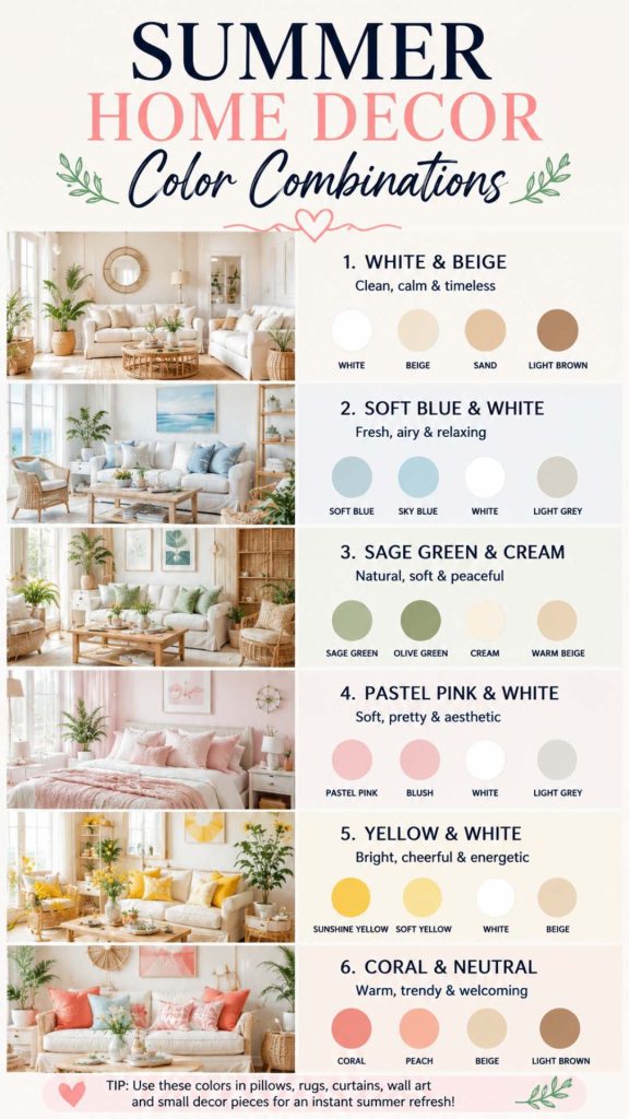
🎯 10. How to Mix Colors
Mixing colors can feel confusing. But it doesn’t have to be. I always follow a simple rule—keep it balanced and not too crowded.
Here’s how to do it:
- Stick to 2–3 main colors
- Use one dominant color
- Add one or two accent colors
- Keep neutrals as a base
- Avoid mixing too many bold tones
Simple combinations always look better. Clean. Balanced. Easy to live with.
🌞 CONCLUSION
Choosing the right Summer color palette doesn’t have to be complicated. Simple, light, and balanced colors can completely refresh your space without a full makeover.
I always believe color is the easiest way to change how your home feels. Start small. Try one palette. See what works for you.
Your space should feel light, calm, and enjoyable—especially in Summer.